Motion graphics on screens: information read in passing
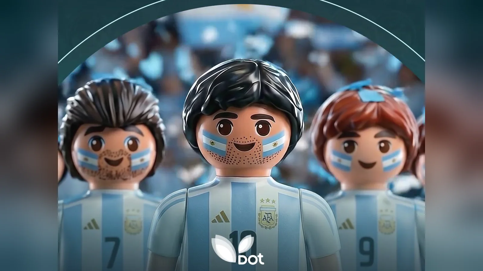
Motion graphics is graphic design in motion. On a shopping center screen it helps organize information that is read in passing: benefits, dates, conditions. It works when the information is separated into layers, the important part comes first and a visual element, such as a character, holds attention while the rest is read.
Why a promotion with many conditions is hard on a screen
A shopping center promotion is almost never a single sentence. It has a minimum purchase amount, a mechanic, dates, prizes, participating brands and fine print. The screen, on the other hand, has a few seconds and an audience that is walking.
The usual answer is a static card with all the text. It does its job of informing, but almost nobody reads it in full. Motion graphics makes it possible to spread that information over time: each piece of information appears when the previous one has been understood.
That is the problem solved by the piece for DOT Baires Shopping's Playmobil benefits. The activation combined a minimum purchase amount, uploading the receipt to ¡appa!, prizes from different brands and a Playmobil of the national team. All of that had to be read in a few seconds.
How information is organized in layers
Organizing in layers means deciding what is read first, what comes next and what is left for whoever stops. In a promotion, the first layer is the benefit: what the person gets. The second, how they take part. The third, the conditions.
Each layer has its time on screen and its typographic hierarchy. The benefit is large and stays longer. The mechanic comes in short sentences, one at a time. The conditions appear at the end, legible and without competing with the rest.
At DOT, information design, motion graphics, animation, typography and brand integration were worked on as a single system. The communication kept its promotional clarity and gained attention and rhythm, without becoming more complex than necessary.
What a character is for in an informative piece
Moving text informs, but it struggles to hold the eye. A character gives the eye a place to come back to. In the DOT piece, the Playmobil figures work as a visual anchor while the information appears around them.
Something similar happens with MINISO's characters for Children's Month. In the pieces for its in-store screens, Yoyo and the brand's penguin tell the date, and the title arrives when the character already has people's attention.
The character accompanies the information and gives it time to be read. That is why its movement should be simple while text is on screen, and more expressive in the moments without text.
How typography is handled for reading in motion
On a shopping center screen, typography has to be read from a distance and while the person walks. Some rules that work in almost any piece:
Few words at a time, with one idea per card.
Typefaces with good weight and contrast against the background.
Time to read the sentence twice before it leaves.
Text that comes in with movement and stays still while it is read.
Nothing important right against the edge, where the screen's frame can cut it off.
The exact measurements depend on each screen: resolution, proportion and reading distance. Specifications and technical delivery of video for LED screens covers what to ask for before producing. If the piece goes to several screens, adapting a campaign to many screens explains why each format calls for its own version.
Motion graphics also works on smaller, closer screens. Content for screens at the point of sale covers what changes when the audience is a few meters away, and the guide to content for LED screens lays out the whole topic.
Frequently asked questions
What is motion graphics?
It is graphic design in motion: typography, shapes, icons and illustrations animated to communicate an idea or a piece of information. In advertising it is used on screens, social media and presentations, because it makes it possible to organize information over time and guide the reading. Unlike a static card, it decides what is seen first, what comes next and how long each thing stays.
How is a promotion with many conditions communicated?
By separating the information into layers. First the benefit, then the mechanic for taking part and finally the conditions. Each layer has its time on screen and its size. A visual element, such as a character or the product, holds attention while the rest is read. That is how DOT Baires Shopping's Playmobil benefits were handled.
How much text fits in a piece for a screen?
There is no fixed number, because it depends on the size of the screen, the reading distance and the length of the piece. The practical rule is one idea per card and enough time to read it twice. If the information does not fit, it is better to spread it across more cards or another piece than to make the text smaller.
Motion graphics or generated video?
It depends on what has to be communicated. If the piece has to inform about benefits, dates or conditions, motion graphics organizes the reading better. If it has to create desire or tell a story, video, filmed or produced with AI, usually works better. Many pieces combine animated characters with motion graphics, like the ones for DOT and MINISO.
DOT's promotion, layer by layer, is in the Playmobil Benefits case, and the service in retail, screens and DOOH.


